Prototyped the next stage of MAX's web Experience –

→ Freshening up the MAX brand with bold, dynamic web layout to catapult a new era for the org
about max
MAXlive produces, develops, and deploys groundbreaking live-art experiences at the intersection of artistic expression, scientific inquiry, and technology in New York City.
MAX's website is the main resource for potential donors, audience members, or collaborators to learn more about just what the organization does.
I initially joined MAX as a Strategy Intern in early spring. When the organization began planning a platform redesign, my role organically shifted toward UX. This transition was marked by a comprehensive site audit, competitive analysis, and user persona research—initiated by the Board of Directors. With a deep understanding of MAX’s business goals from my strategy work, and a skillset aligned with the project’s needs, the shift presented an exciting opportunity to make a meaningful impact.
After sharing my prior experience with Figma and FigJam, I was given the lead on the redesign initiative. Collaborating with two fellow interns, I led this 6-week capstone project from foundational research through to high-level UX recommendations.
6 weeks, 2025
ROLE
UX Lead, Product Designer
Team
MediaArtXploration Intern Cohort– Iryn, Asem, and myself
Objectives
Toward a Scalable, Cohesive Design System
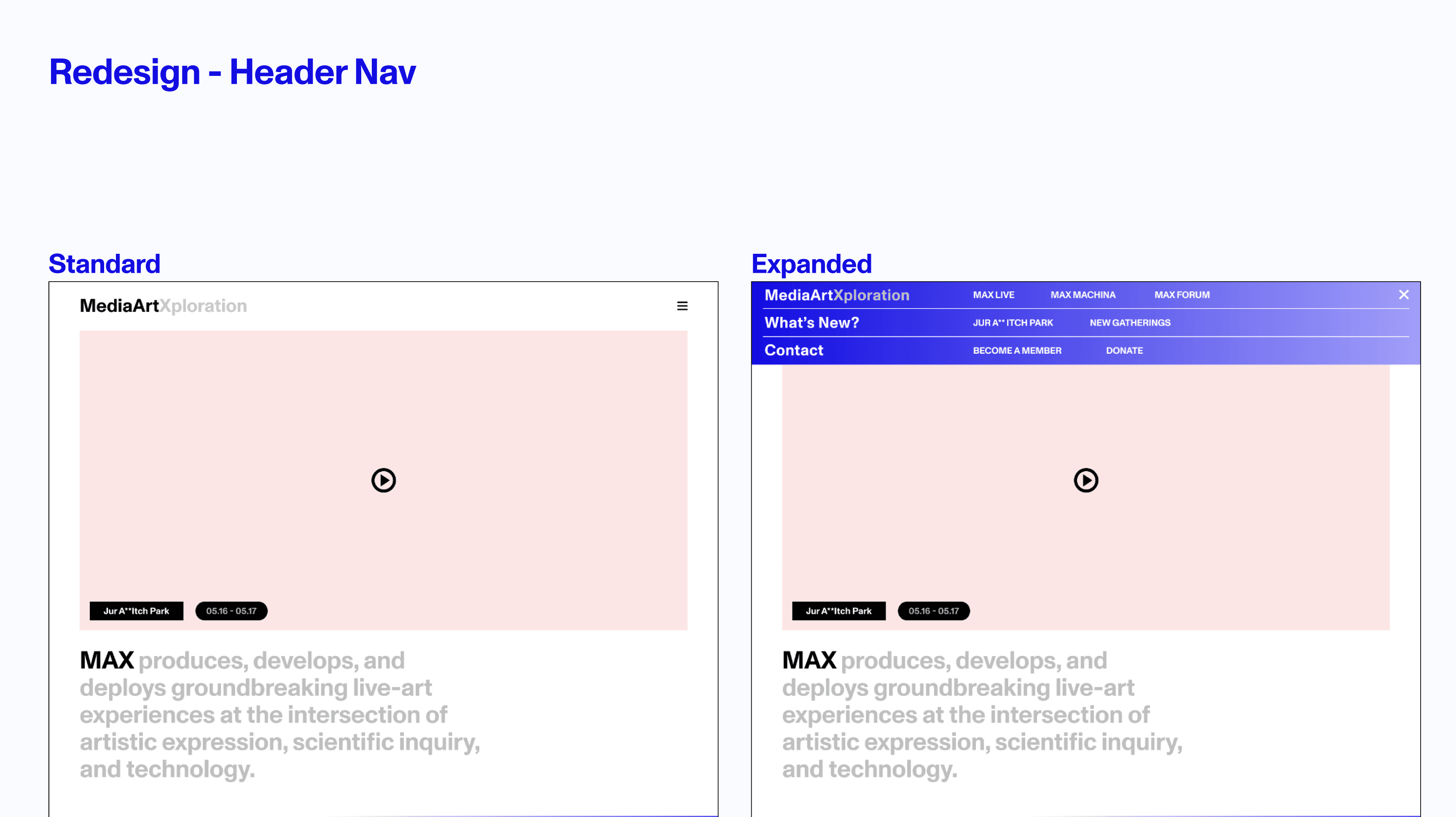
-> Make sure MAX’s “what” is clearly defined on the hero section
-> Offer a fresh Navigation system organized by MAX’s three pillars
-> Introduce new visual intrigue through color + component styling
-> Introduce Event Calendar
-> Reconfigure the footer to prioritize Contact and Social Engagement
-> Create a template system for MAXlive, MAXmachina, and MAXforum pages to be used continuously
-> Establish a color blocking, column-based stylistic identity
my Design process
I led design of an entire audience resource platform to boost brand "what" and "why" messaging, access to donor packages, and event reservation visibility. My design process included research, ideation, and design phases. Simultaneously I also worked on the platform's branding and visual identity.
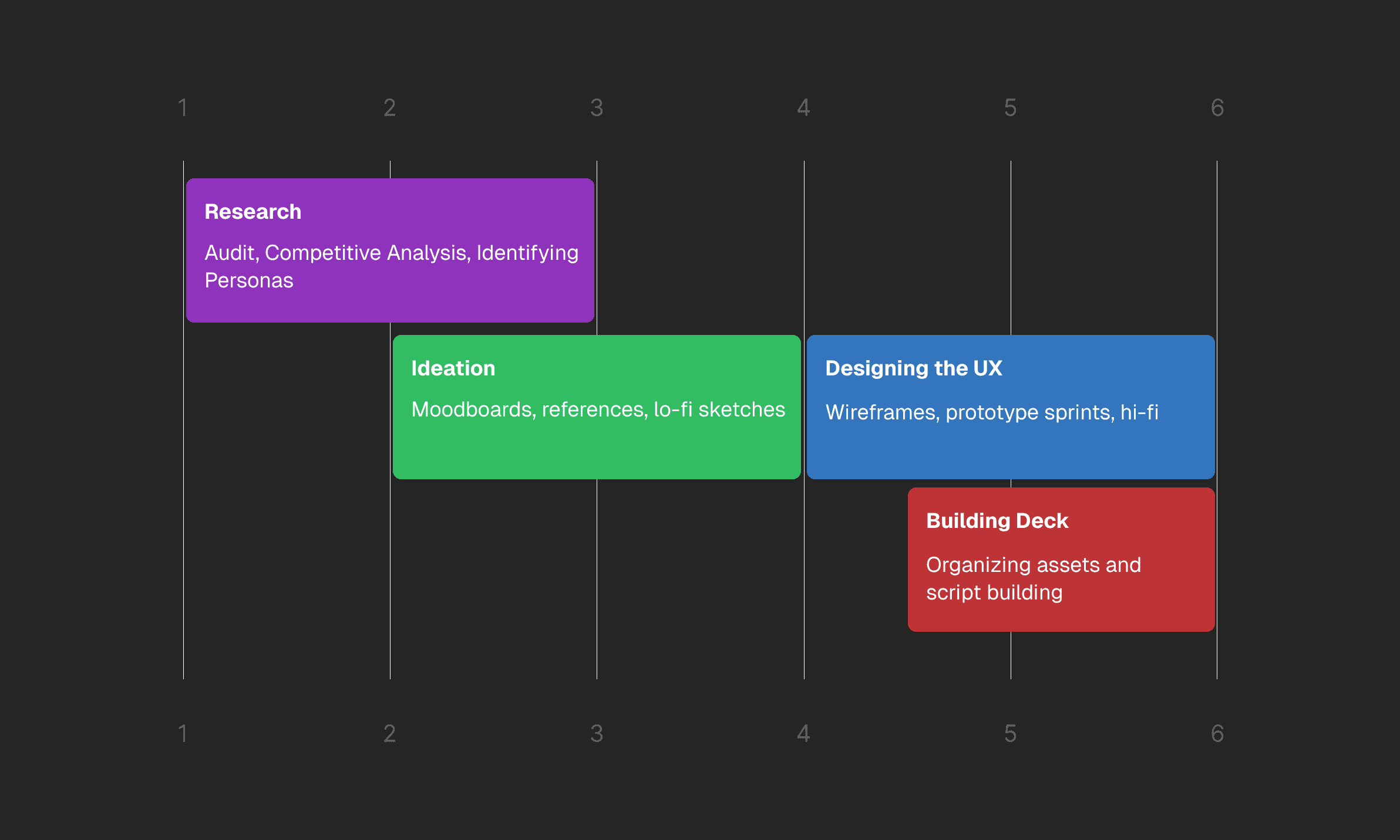
→ Project timeline
👬 Solution Previews in Figma
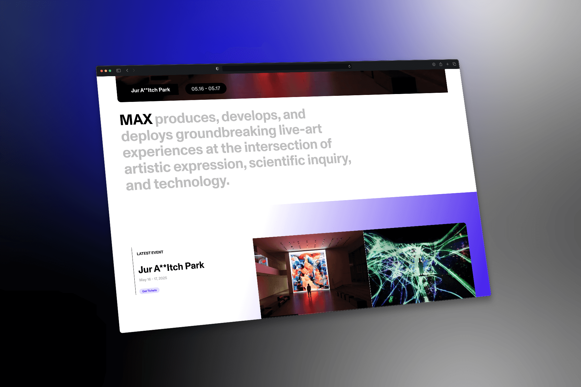
home page
Comprehensive home page that features the brand "what" in the hero section, the latest event, dynamic gradients, and an Events Calendar component.

max pillar pages
Offer a template system for MAX's brand pillar pages (MAXmachina, MAXlive, and MAXforum) that includes a marquee hero section, recent events, and the artists attached – this consistency clearly establishes the organization's story.

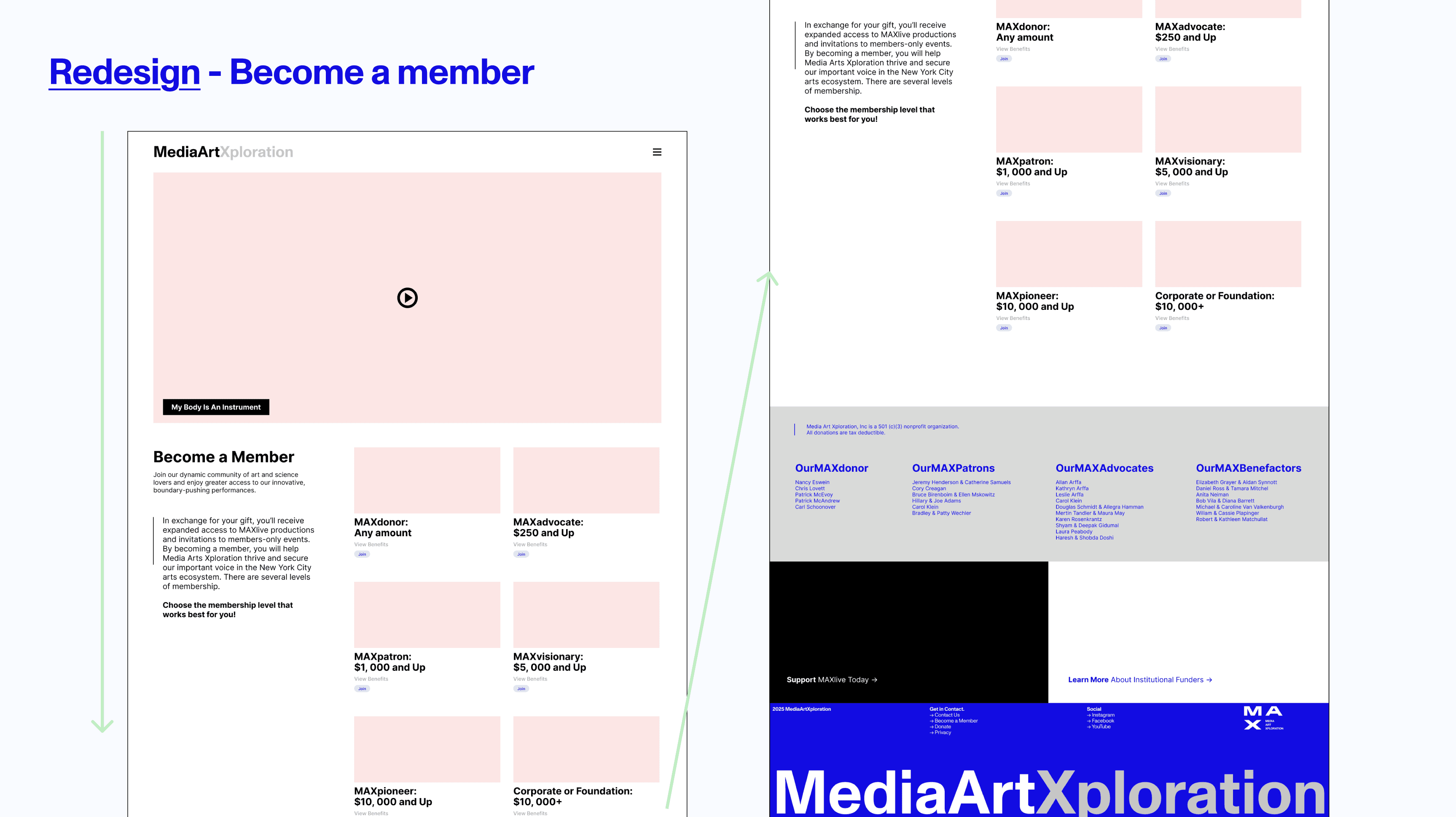
become a member
Donors are the reason MAX can even exist – it's important that accessibility to this page and the materials on it concretely tell it how it is.

User Research
identifying the challenge
💡 How can we reaffirm MAX's values, articulate our "what", and drive attention to events so donors and audience members can facilitate conversations and share the organization's culture?
AUDIT TAKEAWAYS
The pages in question: Home, Projects, and Become a Member

→ Home

→ Project Pillar Page

→ Become a member
🚨 key issues
Inconsistent Visual Hierarchy: Misaligned boxes, unclear CTAs (“Join the Community” feels passive).
Disjointed Component Design: Buttons, colors, and type vary across MAXlive, MAXmachina, and MAXforum.
Confusing Navigation Structure: Overlapping elements in the nav bar and unclear categorization of content.
Poor Content Grouping: Donor lists are overwhelming; lack of section breaks makes scanning difficult.
Limited Accessibility & Scalability: Typographic issues and footer inconsistencies hinder usability.
💪 strengths
Strong Visual Storytelling: Hero images and embedded video establish tone and intrigue.
Distinctive Brand Aesthetic: MAX’s bold typography and vibrant blue pop when used consistently.
Engaging Footer (with room to grow): Great foundation for global calls to action across pages.
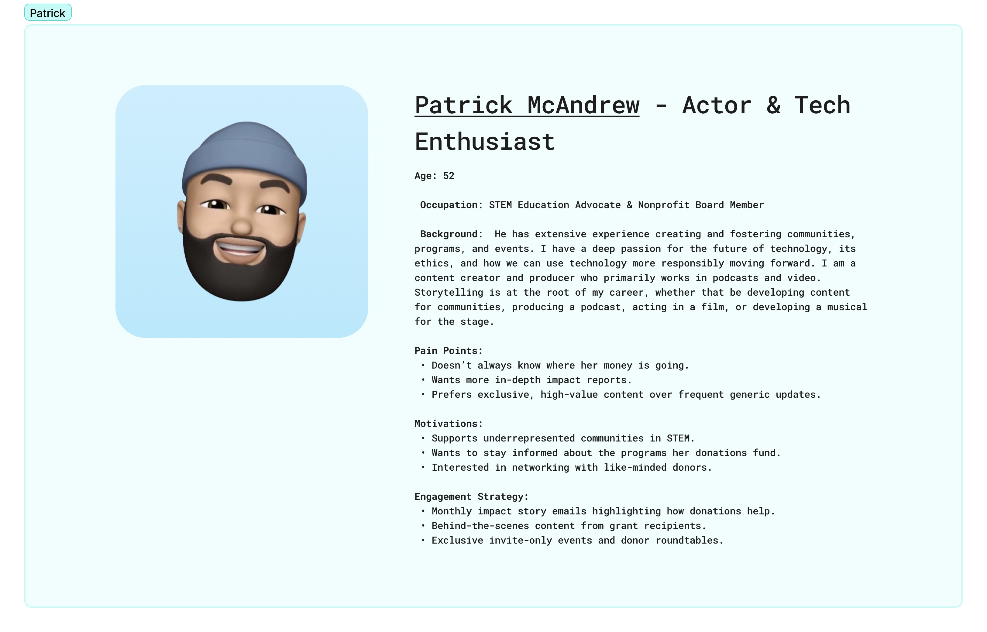
user persona
Our team met with our Board and manager collective to identify the personas of focus

Design
inspo from the landscape
Understanding external trends and expectations

wireframes


Three-Pillar Navigation System → Helps him articulate MAX’s full ecosystem and drive attention to individual program areas
Color Blocking + Grid-Based Visual Identity → Reflects innovation and gives the impression of a well-resourced, thoughtfully led org
Donor/Partner Recognition Section → Validates Donor's role and showcases transparency in partnerships and funding structure
Repeatable Templates for MAXlive, MAXmachina, MAXforum → Shows operational maturity and makes scaling programs easier—reassuring for continued donor investment
Reorganized Footer (Contact + Social First) → Makes it easy for Patrick to facilitate conversations, share with press/funders, and continue engagement
FInal stills

Reflection
lets get to developing!
➡️ After presenting my findings, insight, and prototypes to the MAX board, they offered me a summer contract to fully develop the site in Framer. A fun opportunity with awesome people, and this is just the beginning.
Through this experience, I gained confidence in my UX design skills, design intention, question asking, storytelling, stakeholder management, and truly felt a sense of product ownership.